
Joffrey Ballet Brand Identity Redesign
Project Scope
Logo Rebranding
Brand Identity System
Role
Independent Designer
Timeline
7 Weeks
About
The Joffrey is a world-class, Chicago-based ballet company and dance education organization committed to artistic excellence and innovation, presenting a unique repertoire encompassing masterpieces of the past and cutting-edge works.
As such, the ballet company is deserving of a new brand mark that uniquely represents their goals and impact that they have had in the ballet industry and dance form.
Verbal Inspiration
The process of creating a new mark for The Joffrey Ballet started with generating a list of both conceptual and concrete adjectives that describe the dance company, its dancers, performances, and culture in relation to the city.
Through this step, specific words were chosen to fuel the concepts of the early sequential sketches. The bolded words were chosen because they explained the distinct impact the Joffrey has had on ballet, as well as being adequate descriptors of the dancers themselves.

Visual Research
Going off of the verbal inspiration, the following images were collected as visual representations of the chosen adjectives.
This first set of images focuses on the dancers themselves as they display connection, support, and collaboration in a dynamic manner.

Movement
The second set of images focuses on the idea of movement outside of the human body and how it can be represented in other forms.
On the top movement is shown through the flow of the ink being suspended within water. Whereas the bottom images display movement through fabric.

Body in Motion
Lastly, this set of images portray movement outside of the realm of ballet as the dancers contort their bodies to indicate energy, rhythm, and momentum. The images also correlate with movement that can be generated by the flow of fabric and cloth.

Initial Sketches

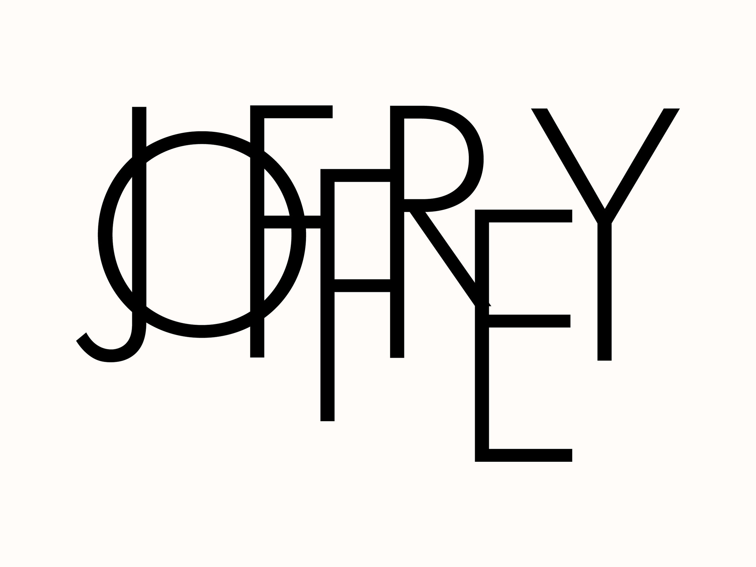


Direction 1
After collecting images based around the different forms of various dancers, the first mark sketches focused on the idea of connection, interaction, and movement. The sketches explore different ways of how letterforms can be offset to indicate movement while connecting to one another similar to how ballet dancers perform.


Direction 2
The letterforms in the sketches for Direction 1 appeared to be too stiff and lacked a sense of movement, thus Direction 2 focuses on exploring a different typeface that represents rhythm and the whimsical and dynamic movement of dancers. The script typeface also hints at the idea of connection and flow as seen within choreographic performances.
Refinements
Once the script typeface was chosen, the letters were further manipulated to further represent the idea of motion in a manner that mimicked the forms of the dancers and images of fabric to generate a sense of rhythm in the full mark.

Typefaces
Publico and Gotham were chosen as the typefaces of The Joffrey Ballet because they represent how the Joffrey modernizes the classic practice of ballet.
Both are used in traditionally print materials for the company, while Gotham would be the main typeface for digital materials.

Patterns
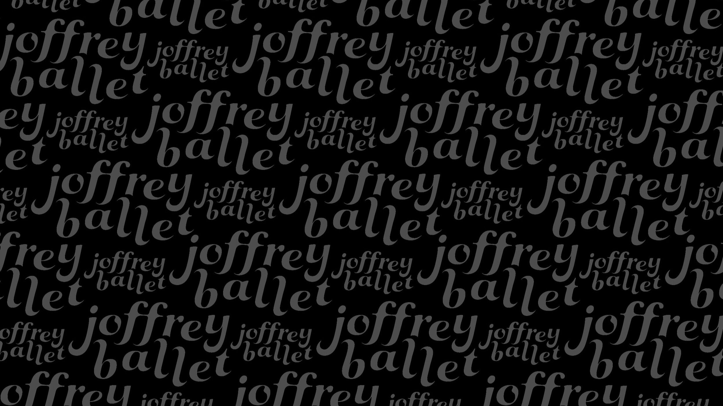
Pattern 1
Expanding upon the identity of the mark, I have created a primary pattern for the company through the repetition and resizing of the logotype. It creates a pattern that generates a sense of rhythm and movement.

Pattern 2
Expanding upon the visual identity of the company, a secondary pattern was created based upon the visual shape of the “L” letterform from the logotype. This pattern will be used in various posters and other marketing materials for the company.
Stationery
Ticket Design
Brand Collateral
Street Banner
Posters

End Note
Overall, the Joffrey is a world-renowned ballet company that is deserving of a branding identity that showcases their unique take and impact on the ballet industry. Their previous mark was focused on representing them as a distinct Chicago studio, however, their legacy is much greater than that. As such, the redesigned mark showcases the nature and style of the Joffrey Ballet.