
SAME Café Logo Redesign
Project Scope
Logo Rebranding
Role
Independent Designer
Timeline
3 Weeks
SAME Café
At SAME Café their goal is to serve quality food to whoever walks through their doors, while emphasizing the importance of food and community, rather than price. SAME Café is the first non-profit restaurant in Denver and they work towards building a healthy community by providing quality food to the neighborhood in a respectful and dignified manner to all who come. Everyone, regardless of economic status, deserves the chance to eat healthy food while being treated with dignity.
Previous Mark
The previous mark for SAME Café pairs two different typefaces together that have very different stroke weights that make the viewer focus on only one part of the name, rather than the whole name.
However, the mark does have a sense of community as the group of various spoons are lined up together side by side. But, there is nothing truly remarkable about the previous mark that represents the idea of both community and SAME Café’s goal of providing fresh food to whomever walks through their doors.

Initial Sketches
The logo was based on the concept that the restaurant has an open door policy and everyone is welcomed regardless of who they are. My process eventually evolved to incorporating the idea of mentorship within the logo.

Color Studies
The original logo for SAME Café was primarily a light green color to indicate the organic nature of their food. In my redesign of their mark I decided to forego the green color of their logo because the café’s organic mission would be represented through the leaves of the new logo.
Instead, I wanted to create a fresher and more vibrant tone to the logo by utilizing colors that were not green. I took inspiration from the colors of produce at farmers market to indicate that fresh and natural food can be represented by colors besides different shades of green.

Brand Identity
For the SAME Café’s brand, their logo is made from the typeface Apercu Pro and this typeface does not appear anywhere else besides the logo. Outside of the logo, any text that the restaurant uses will be set in the typeface Avenir Next.
These two typefaces were chosen because they indicate a sense of modernity that aligns with SAME Café’s forward thinking approach as they are the only restaurant in the Denver area whose operations are 100% volunteer based and are a pay-what-you-want café.

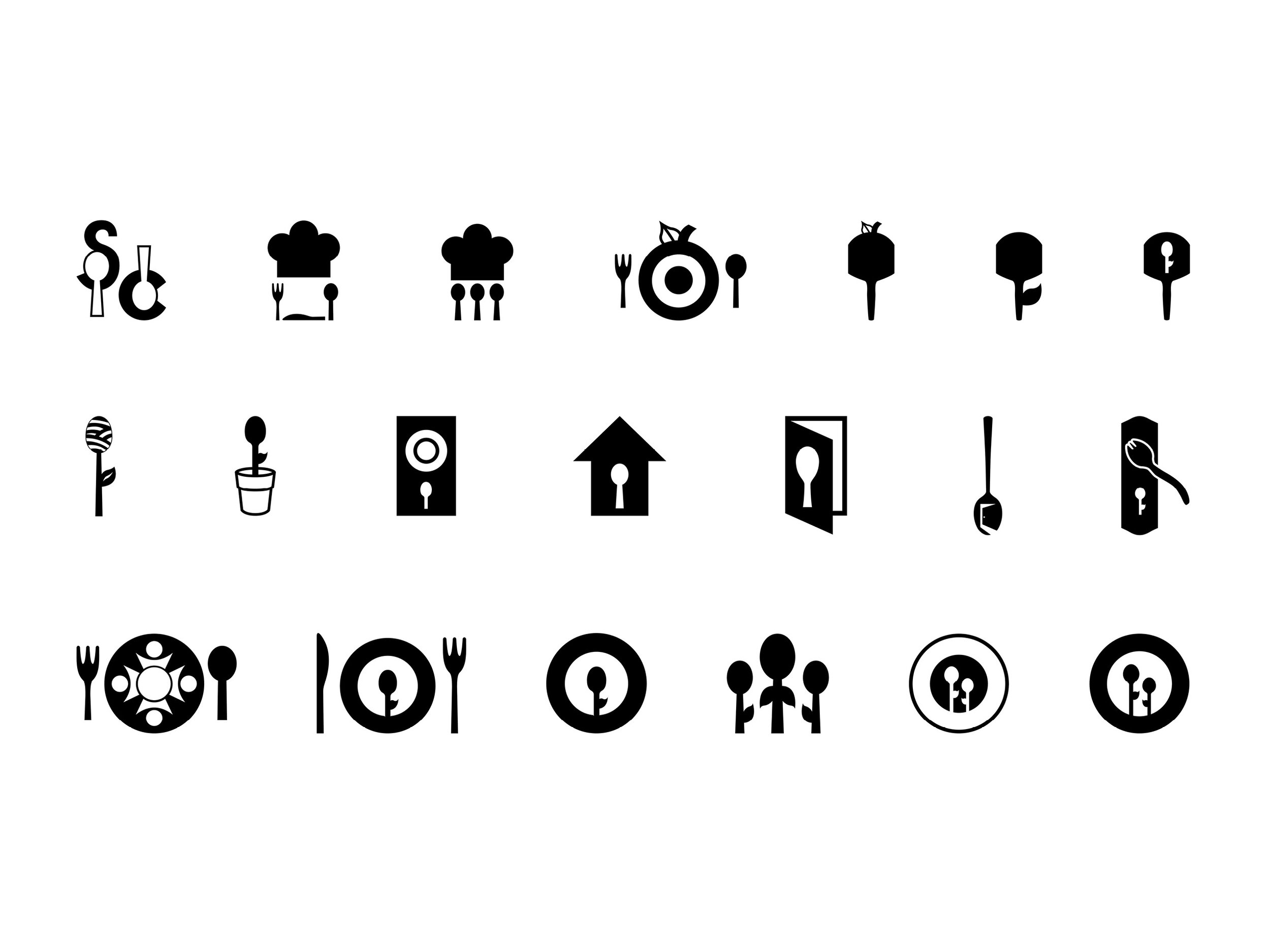
Iconography
These icons were designed to be visual guides for Same Café’s menu and to inform the customer of the menu items. The icons include a symbol for soups, salads, pizzas, gluten-free and vegan options.


